|
This week, we made a company letterhead. At the beginning of class on Tuesday, we were told that our letterhead should have similar characteristics to the business card, but it should be more universal so that it can be used company-wide and not just for personal use. After having a few minutes to brainstorm (and consulting with Pinterest, for me), we had the opportunity to give advice and ask others for advice on how to construct our letterhead design. 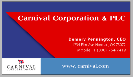 The back of my business card inspired my design for the letterhead. The company I chose for the first design was Carnival Cruise Line. As seen above, the back of my business card has a shape that resembles a ship. I thought using this shape was subtle and clever, and after speaking with a few of my classmates, it seemed they thought so, too. These conversations persuaded me to use this shape at the top and bottom of my letterhead so that it can hold information and tie in to my business card. 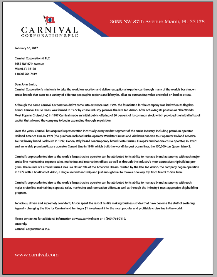 Here is my final letterhead design.
I liked the challenge this design gave me by forcing me to keep it simple and not overdo it. There were a few times during this week that I tried adding a left margin or adding another background design through the center of the screen, but I had to remember that the assignment is supposed to represent something universal and cost-friendly for print. The best part about this assignment was finally feeling a little more comfortable using InDesign than I was last week. Self-Interview: What was the goal of this assignment? This assignment required us to make a letterhead that could be used company-wide for the organization we chose to design last week. Also, the letterhead should have similarities to the business card as if they go hand in hand. How did you come up with the layout for your letterhead design? After talking with my classmates Tuesday about the ideas for my design, I realized other people felt like the "ship" shape of my business card was the strong point of it. That influenced me to keep that shape and use it for the letterhead. Did you change your design in the process, or stick with your original idea? Not really. I thought about adding to the design (making a left margin or adding a background design), but I decided both this assignment and the company I chose influence being simple. This caused me to stick with my original idea and control myself from adding other things. Did you find InDesign easier to use the second time around? Definitely. Nothing is better than trying to use a tool and not having to Google how to use the tool. I even used the scissor tool this time around, which came in handy. Are you happy with the way your design turned out? I think the design definitely accomplished what was asked of us for this assignment. I like that it challenged me to not overdo it and to think universally, since it would be used by many in the company. I'm excited for the next project!
0 Comments
Writing the News ReleaseIn this unit, we were asked to understand how to write and format a news release. Contrary to popular belief, the news release is not irrelevant; in fact, news releases are more important than ever. In the Writing for Mass Media course, we were given a project similar to this one. It was, for this assignment and those of the other course, our job to decipher what information needed to be addressed first in a news release and what subsequent information needed to follow. I was made aware of the inverted pyramid style in the precious course, but got to practice it much more in this unit. 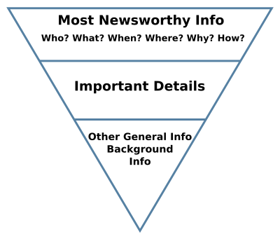 Photo from Wikipedia. In News Release #1, we were given tons of information. Normally, it's clear what needs to be stated first. However, for this assignment, it truly took time to analyze and think about what people receiving this news would need and want to know, and what details follow that. Getting to practice this inverted pyramid style when there was more information than I am used to made me pick up a strategy in crafting a news release. Additionally, I would love to know more tips on where to insert quotes in a news release. I feel that I inserted them in a decent place, but I know that quotes can really add to a story and appeal to its readers.
PR professionals are expected to be able to write well. Whether it's in 140-character format or in a four page news release, PR professionals should be able to convey information in a way that informs its audience. This world is undoubtedly heading into the digital era, but I know that whether for print or for web, effectively conveying the news will always be important to the public. I'm glad that instead of expecting the ways to change digitally, we are practicing the "old fashioned way" of writing a news release. I see this skill set helping me in not only writing news releases, but also telling the important content while writing short excerpts, captions, etc. Print is not dead, it's surely alive! This week, we began our first design: a business card. Over the weekend, we were to look up competitors, aspirations, logos, color schemes, etc. for a company of our choice, so that we could understand the brand before making the design. For this project, I chose Carnival Corporation (Carnival Cruise Line).  Photo from CruiseLnd. Going in to Tuesday's class, I was confident in my understanding of Carnival Corporation's corporate culture, colors, themes, wants, needs, competitors and more. However, I quickly realized that although I knew all of these details, I did not brainstorm the layout of my business card before actually beginning to do it in class. This caused me to spend a lot of time thinking and a lot less doing. To be honest, I expected Croom to walk us through the process, giving us tips and suggestions as we go. This was wishful thinking. The business card was the first opportunity for us to independently work on InDesign and discover different tools, which quickly made it feel like a free for all.  How I felt when beginning to make my business card. Photo from Long Beach Real Estate. The first 20 minutes of class, I had to remind myself to be patient and keep trying. After a couple of minutes, though, I actually found that I knew more than I thought I did. On Tuesday, I only got to finish the front of my business card, but I was very proud of how it looked. Shout out to Croom for teaching me the Clipping Path and gradient feather tools, because those two seemed to be the reason the front of my design came together. Between Tuesday and Thursday, I brainstormed for awhile about the back of my business card. I put my ideas to life, and here is my final creation: 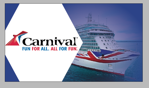 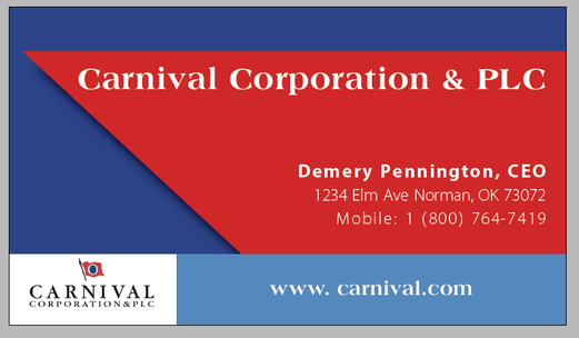 I feel that I've accurately used Carnival Corporation's color schemes, logos, simplicity and typography, and I'm happy with the way my business card turned out. My creativity is nowhere near its peak, but the business card design project forced me to put my foot in the door. I can't wait for our next project!
This week in PR Writing, we have been asked to look into the details of what makes a news story effective. These details, such as the elements of mass appeal, "The Big Five," the ABCs of journalism, inverted pyramid, ledes, bridges and body, work together to convey news: a story that gives the people what they want AND need.  Photo courtesy of 123RF.com. Before this week's readings, I was aware of the importance of using inverted pyramid style so that reader's can be told what's important immediately. However, I didn't know that the lead is supposed to be approximately 30 words (1-2 thin paragraphs). This general guideline shows the importance of saying what matters, first and fast. I'd like to have practice with writing news leads, because I know it takes planning and outlining the most important details of a story quickly and conveying the points effectively.  Accurate depiction of a PR professional on any given day. Photo from http://www.blackleopard-pr.com/blog/2015/4/13/public-relations-vs-event-planning. The elements of the news are extremely important for PR professionals to be aware of, because it's our job to plan, organize, communicate, reflect and prepare for anything in any given scenario. Like I said before, news is what people want and need, and it is expected that PR professionals are able to communicate this to them. Knowing what elements make a news story more intriguing and informative is a helpful skill in this career, as what we must be best at is writing and communicating.
I'm excited to put these skills to the test in the future. Adobe InDesign.What a simple name for such a complicated program. InDesign is undoubtedly useful for web designers, but certainly difficult for beginners. From figuring out how to change the background color, to realizing a window and frame aren't the same thing, Tuesday's class was a mixture of learning and frustration. 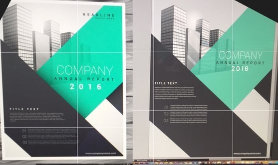 On Tuesday, we recreated an Annual Report using InDesign. Here is the original (left) compared to my attempt at recreating it (right). Although there's still improvement to be made, I'm proud of my first InDesign assignment. While attempting to recreate the Annual Report page, I learned that I have to start from the very back of the page and work my way to the front. Once I was able to see the project one step at a time, my job became much simpler. I think what frustrated me the most was the illiteracy I felt when I couldn't figure out how to simply change the text colors. Once I googled it and found out about the eye dropper tool, life became much easier. After the class was over, my recreation actually looked very similar to the original model, which was a relief. I don't know how Croom put up with the million questions being thrown his way, but the silence in the room toward the end of class showed we were starting to get the hang of it. Maybe this program isn't so bad after all. Am I so proud that I will hang it up on my refrigerator? Maybe. 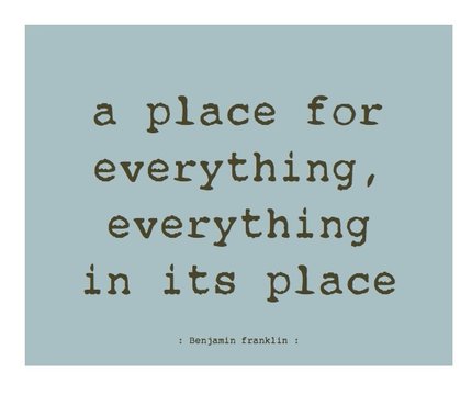 Ben Franklin said it best. Photo from http://blog.proqc.com/simplified-5s-what-is-it-why-is-it-important/. Next came Thursday's class. This class mostly taught me just how much of a perfectionist I am. Using columns and type setting can look extremely messy at first, which gave me a bit of anxiety. It took being able to overlook the original draft and begin putting the text in its place to make the assignment seem a little less stressful. All the guide-lines that come with columns can be a bit overwhelming, but using the command 'W' makes everything look a little less crazy. I'm looking forward to the day when all of this design stuff comes easy to me. Up next...Next week, we begin our first design project: a business card. I'm looking forward to testing my creativity (and patience...) next week.
It's been an interesting few days, InDesign. See you Tuesday. Contrast, repetition, and alignment, oh my!There are many aspects that go into creating a design. Leading the eye, utilizing blank space and CRAP, to name a few. The most interesting lesson I learned this week is that less is more. Though you can use fonts, alignment, repetition, proximity, contrast, etc. in a design, utilizing all of these is not always the answer. Simplicity is key.  Picture courtesy of http://design-elements-blog.com/2012/07/. This week we had a crash course of the basics of graphic design. All of what we learned, to me, meant learning to be a minimalist. I tend to overdo things, so I'm interested to see how this principle will challenge me as we start "using our machines" next week. At the beginning of designing I will keep in mind contrast, repetition, alignment and proximity, or "CRAP..." Which will be easy, because this is how I feel heading into creating our first design.  Accurate depiction of my face thinking about learning Adobe programs. Photo from GIPHY. I've always envied the people that know how to make graphic designs, but I've never pursued knowing how to do it myself. I'm glad this course will somewhat force me to learn. CRAP, the acronym describing important design elements, stands for certain words in design. The first, contrast, requires knowing how colors work together. I know the color wheel; blue is the opposite of orange, purple of yellow, red of green, you get the point. Next is repetition, which is easy enough:
Next comes alignment. Alignment is knowing that this paragraph looks odd when comparing it to the rest. The majority of this blog is aligned left, and this paragraph is aligned right, which just throws everything off. Got it. Lastly is proximity. Proximity is space, how close and how far things are from each other. In some instances, proximity can help orphans, or widowed writing. Thankfully, the Weebly site changes the proximity of my writing automatically so I'm not having to worry about the alignment of this blog. Thanks, Weebly! 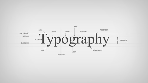 Photo from https://www.pmg.com/blog/typography-101/. We also went over the elements of typography. The main principle I learned about typography is that in a design, you should normally stick with 2-3 font families. I also learned the difference between serif and san-Serif fonts. I know that this font I'm using is a san-serif, because it doesn't have "feet." Typography can either help or hurt a design, so it's important to make sure fonts don't detract from a design's message. I'm excited to use all that I've learned thus far from PR Publications and begin designing. But, for now, I'll stick with watching Lynda tutorials.
 Photo courtesy of http://www.keepcalm-o-matic.co.uk/p/keep-calm-and-be-literate-4/. Writing with Clarity
Reducing Clutter
Sentence Variety
Sentence Emphasis
This week in PR Publications, we were given a very simple first assignment: watch the movie “Inside Out.” Although I was thankful for such a simple assignment, I questioned the movie’s importance and relevance to PR Publications. I quickly found out how much I could learn from the movie simply by discussing the process of its creation. 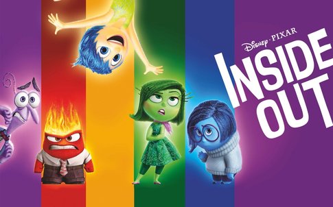 Pictured are the internal emotion characters from Inside Out. From left to right: fear, anger, joy, disgust and sadness. (Picture from https://wall.alphacoders.com/by_sub_category.php?id=229527). Inside Out is a unique (and adorable) movie that takes place mostly inside of the main character’s mind. After watching the movie individually, as a class we watched “The Story Behind the Story,” which explains how the original idea for the film changed and transformed numerous times before deciding on its final version. It turns out the back story of this movie has sparked interests of many. This trial-and-error process depicts the steps of the brainstorming and design processes: empathize, define, ideate, prototype and test. 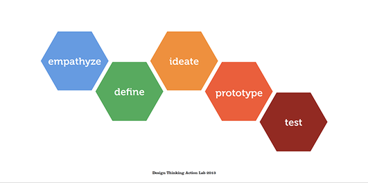 The five steps in the design process challenge and build off of one another. (Picture courtesy of http://myvisualbrief.com/design-thinking/). Getting to see how each of these steps work together and build off of each other is interesting, and it helps me understand that true creativity takes work, and time. I am excited to see how PR Publications will challenge my creativity this semester. Additionally, I'm excited to put my creative skills to work with Adobe programs, since I have little to no experience with them thus far. I loved how this class started out, and I can't wait to create creative work to add to my online portfolio!
 In the words of Adele... Hello, it's me. About MeMy name is Demery Pennington, and this is also the name I go by (think of it pronounced like "emery," but with a "D"). Although I was born in Helena, Montana (random, I know), Tulsa, Oklahoma is home to me. I am currently a sophomore here at the University of Oklahoma and plan to graduate in May 2019. Choosing a MajorIn my first few weeks as a freshman at OU, I was completely indecisive in choosing a major. I visited the Major Exploration Office here at OU, and answered a bunch of questions about my likes, dislikes, personality, etc. Long story short, I ended up choosing public relations... The same major my sister graduated with from Gaylord College in 2015. I love my sister, but I definitely didn't want to pursue the same major she did; however, she really is the reason I am so 'jazzed up' about public relations. Seeing her in the workforce and talking to her about her day-to-day lifestyle in a PR job is extremely exciting and interesting. 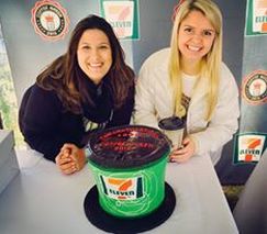 Above is my sister (right) and her coworker (left) celebrating 7-eleven's new "coffee queen." My sister is the "Communication Coordinator" for 7-Eleven's corporate office out of Dallas, TX. MotivationThese conversations, about my sister's enjoyment and interest in her job, motivate me. She came from the same background I am coming from, and I know if I put in the effort, I can end up attaining a job I truly enjoy just like she has. I have always been an internally driven person, so having someone so close to me as a mentor in the PR world is an added bonus. WritingWriting has always been a hobby I truly enjoy. I noticed I have a passion for writing throughout high school, as my peers would dread writing essays for class while I found it exciting. It may be cheesy, but I feel that writing comes easily to me. I am a huge fan of technology, but I also still take notes on paper and write old fashioned letters, journals, etc. Writing is a huge part of my life, and I'm excited to see how I can improve my writing skills throughout this course. PR rocks!
As a sophomore student at the University of Oklahoma, I have learned that attending class and constantly studying can be extremely dreadful, yet absolutely necessary. However, it doesn't have to be. I have learned through my experiences thus far in college that the atmosphere you surround yourself with while studying can improve or decline your ability, and optimism, to learn. This is why the Gaylord balcony is my favorite place on campus; it gives me the ability to refresh my brain and truly enjoy the joy that is college life. You can find access to the Gaylord College balcony on the third floor. SunlightSunlight has the ability to boost your levels of serotonin, and can help your mood. During any semester, spending excessive time indoors can get repetitive. This constant atmosphere can make learning feel unenjoyable. During school hardships, I find it important for me to see the outdoors numerous times throughout the week for a breath of fresh air... Literally. Whether I am reading, writing, or just hanging out in between classes, I have found that the Gaylord College third floor balcony can help me feel more awake, alert and happy. QuietAlthough I am an extremely extroverted person, sometimes I need space from others in order to relieve stress and relax. It's true... Extroverts sometimes need time alone. While there are often other people on the Gaylord balcony, it seems there's an unwritten rule of peace and quiet. I've found that Gaylord students are naturally respectful (maybe I'm biased), and this has proven true each time I have visited the balcony. College can be overwhelming, and sometimes helping yourself through tough times just takes a change of scenery and some quiet time alone. The Gaylord balcony is the perfect place for all of the above. AtmosphereWhether strictly working on homework or admiring the views, the Gaylord College balcony has opportunities for both. If you want to take a look around, you can see a good amount of the OU campus from the balcony: the newly renovated football field, Gaylord students, the dorms and Lindsey Street to name a few. Yet, if you're looking to buckle down, the balcony has outlets and even lights for when the sun goes down. It provides the perfect balance of serenity and focus.  The Gaylord balcony produces happy students! Picture courtesy of https://www.dreamstime.com/stock-photography-happy-studying-image20646992. As you can see, there are benefits to finding your "happy place" on campus. The University of Oklahoma is full of amazing places to relax and recoup, but my favorite it the balcony on the third floor of Gaylord College. Check it out!
|
Demery PenningtonTaking courses in the Gaylord College of Journalism and Mass Communications at the University of Oklahoma often requires writing blogs. Here, you can get a glimpse of my writing style.
|
