Contrast, repetition, and alignment, oh my!There are many aspects that go into creating a design. Leading the eye, utilizing blank space and CRAP, to name a few. The most interesting lesson I learned this week is that less is more. Though you can use fonts, alignment, repetition, proximity, contrast, etc. in a design, utilizing all of these is not always the answer. Simplicity is key. 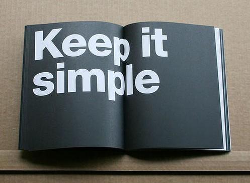 Picture courtesy of http://design-elements-blog.com/2012/07/. This week we had a crash course of the basics of graphic design. All of what we learned, to me, meant learning to be a minimalist. I tend to overdo things, so I'm interested to see how this principle will challenge me as we start "using our machines" next week. At the beginning of designing I will keep in mind contrast, repetition, alignment and proximity, or "CRAP..." Which will be easy, because this is how I feel heading into creating our first design.  Accurate depiction of my face thinking about learning Adobe programs. Photo from GIPHY. I've always envied the people that know how to make graphic designs, but I've never pursued knowing how to do it myself. I'm glad this course will somewhat force me to learn. CRAP, the acronym describing important design elements, stands for certain words in design. The first, contrast, requires knowing how colors work together. I know the color wheel; blue is the opposite of orange, purple of yellow, red of green, you get the point. Next is repetition, which is easy enough:
Next comes alignment. Alignment is knowing that this paragraph looks odd when comparing it to the rest. The majority of this blog is aligned left, and this paragraph is aligned right, which just throws everything off. Got it. Lastly is proximity. Proximity is space, how close and how far things are from each other. In some instances, proximity can help orphans, or widowed writing. Thankfully, the Weebly site changes the proximity of my writing automatically so I'm not having to worry about the alignment of this blog. Thanks, Weebly! 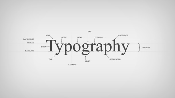 Photo from https://www.pmg.com/blog/typography-101/. We also went over the elements of typography. The main principle I learned about typography is that in a design, you should normally stick with 2-3 font families. I also learned the difference between serif and san-Serif fonts. I know that this font I'm using is a san-serif, because it doesn't have "feet." Typography can either help or hurt a design, so it's important to make sure fonts don't detract from a design's message. I'm excited to use all that I've learned thus far from PR Publications and begin designing. But, for now, I'll stick with watching Lynda tutorials.
0 Comments
Leave a Reply. |

Demery PenningtonTaking courses in the Gaylord College of Journalism and Mass Communications at the University of Oklahoma often requires writing blogs. Here, you can get a glimpse of my writing style.
|
