|
This week, we made a company letterhead. At the beginning of class on Tuesday, we were told that our letterhead should have similar characteristics to the business card, but it should be more universal so that it can be used company-wide and not just for personal use. After having a few minutes to brainstorm (and consulting with Pinterest, for me), we had the opportunity to give advice and ask others for advice on how to construct our letterhead design. 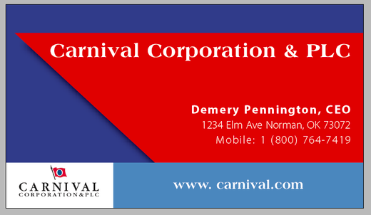 The back of my business card inspired my design for the letterhead. The company I chose for the first design was Carnival Cruise Line. As seen above, the back of my business card has a shape that resembles a ship. I thought using this shape was subtle and clever, and after speaking with a few of my classmates, it seemed they thought so, too. These conversations persuaded me to use this shape at the top and bottom of my letterhead so that it can hold information and tie in to my business card. 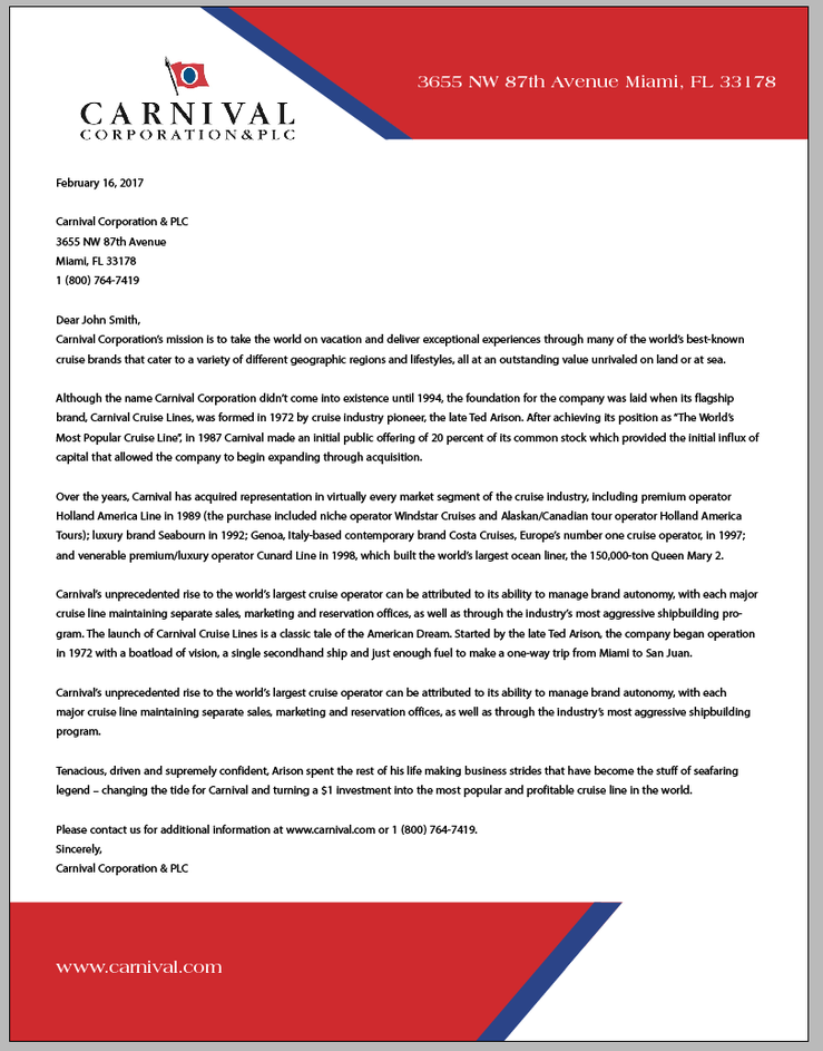 Here is my final letterhead design.
I liked the challenge this design gave me by forcing me to keep it simple and not overdo it. There were a few times during this week that I tried adding a left margin or adding another background design through the center of the screen, but I had to remember that the assignment is supposed to represent something universal and cost-friendly for print. The best part about this assignment was finally feeling a little more comfortable using InDesign than I was last week. Self-Interview: What was the goal of this assignment? This assignment required us to make a letterhead that could be used company-wide for the organization we chose to design last week. Also, the letterhead should have similarities to the business card as if they go hand in hand. How did you come up with the layout for your letterhead design? After talking with my classmates Tuesday about the ideas for my design, I realized other people felt like the "ship" shape of my business card was the strong point of it. That influenced me to keep that shape and use it for the letterhead. Did you change your design in the process, or stick with your original idea? Not really. I thought about adding to the design (making a left margin or adding a background design), but I decided both this assignment and the company I chose influence being simple. This caused me to stick with my original idea and control myself from adding other things. Did you find InDesign easier to use the second time around? Definitely. Nothing is better than trying to use a tool and not having to Google how to use the tool. I even used the scissor tool this time around, which came in handy. Are you happy with the way your design turned out? I think the design definitely accomplished what was asked of us for this assignment. I like that it challenged me to not overdo it and to think universally, since it would be used by many in the company. I'm excited for the next project!
0 Comments
Leave a Reply. |

Demery PenningtonTaking courses in the Gaylord College of Journalism and Mass Communications at the University of Oklahoma often requires writing blogs. Here, you can get a glimpse of my writing style.
|
